

VAMPURR
A Behind the Spreads

Happy summer, everyone! I hope you all hang in there with the heat. It was unbearable for some days here in Austria, but then it was better. I want to share some behind-the-spreads from Vampurr, a summerween book I illustrated and published today!
The Story
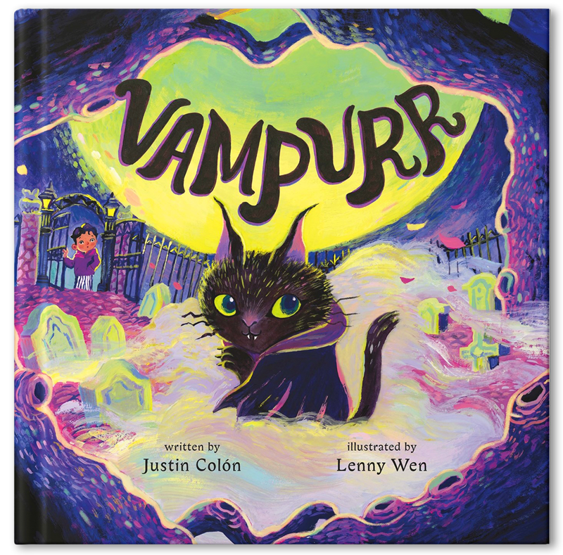
MEET VAMPURR.
Her fur shines blacker than a raven’s feathers.
Her eyes glow greener than a witch’s brew.
But most unusual of all are her long, needle-sharp fangs.
Born among tombstones beneath the blood moon’s light, a vampire kitten longs to find a loving home like her siblings who were adopted right away. But her unusual appearance and abilities send visitors fleeing the cemetery in fright. Until one night, an eerie fog rolls in, bringing with it an unexpected new friend.
How It Started...
In February 2024, my agent, Christy, sent me an offer from FSG (Macmillan) editor Janine O’Malley, with the VAMPURR manuscript by Justin Colón attached. From a quick read, I knew I WANT to illustrate this. It’s exactly up my alley. So, it’s an immediate YES!
So the Process Began...
When I illustrate someone else’s story, I always visualize and choose the art materials based on how I feel about the author’s tone. Justin definitely makes my work easier since his story is visually driven, imaginative, mysterious, and humorous. I felt Vampurr had more of a supernatural than a horror vibe, so I thought an unusual color palette would serve the story well. I went on Pinterest and started gathering references with the vintage neon horror keyword. And it was exactly what I imagined. I was also super inspired by RL. Stine's Goosebumps covers (Oh, how much I miss the series!).
(When I first worked on Vampurr, I had not watched Beetlejuice by Tim Burton. Later, after watching it on a flight, I realized Vampurr’s colors resembled it quite closely. So you could picture Vampurr’s tone now!)
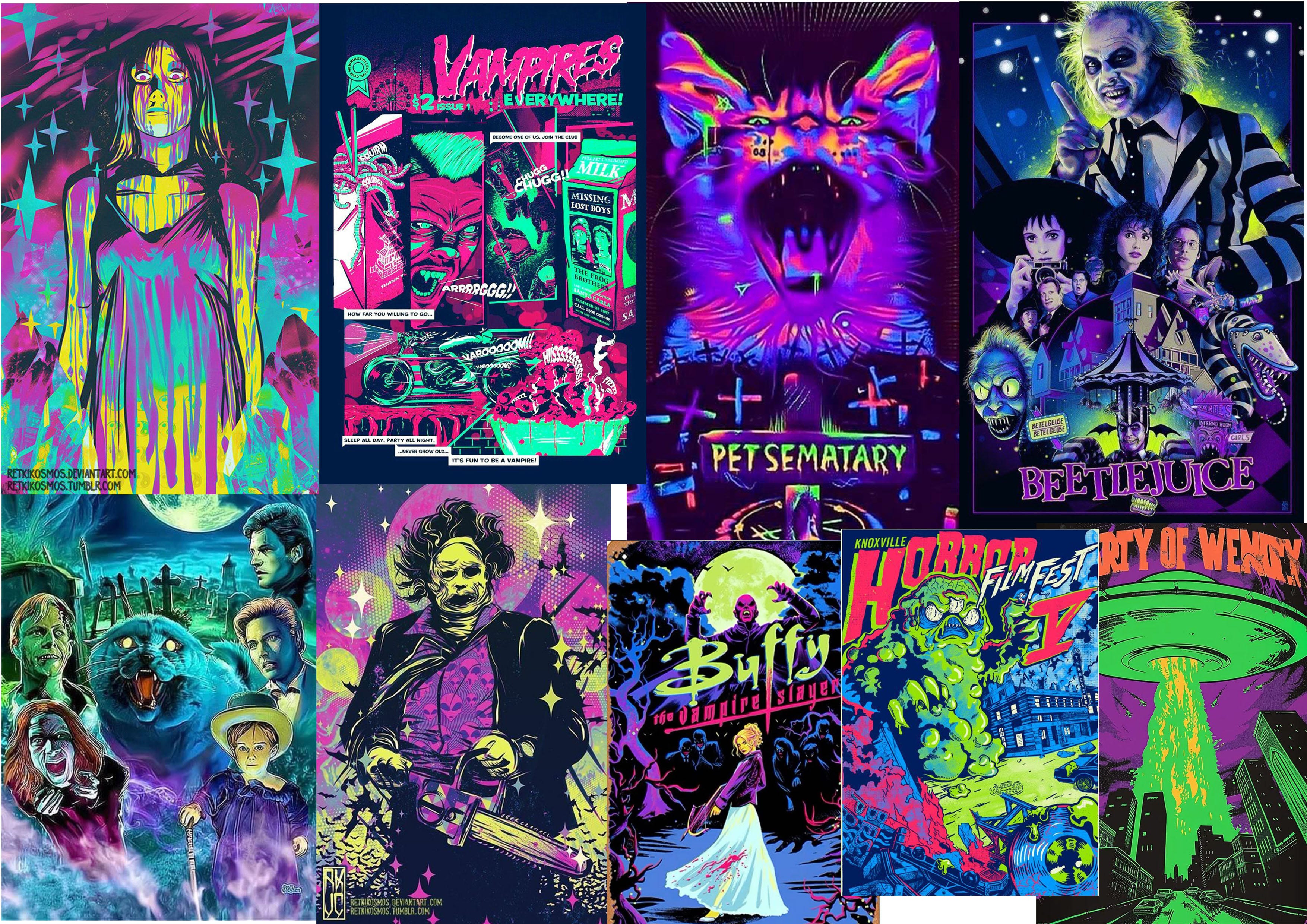
Then the process of choosing material and color palette began. I visualized bold, eye-catching, and contrasting colors with acrylic gouache. The most challenging part was designing Vampurr and determining which material to paint her with.
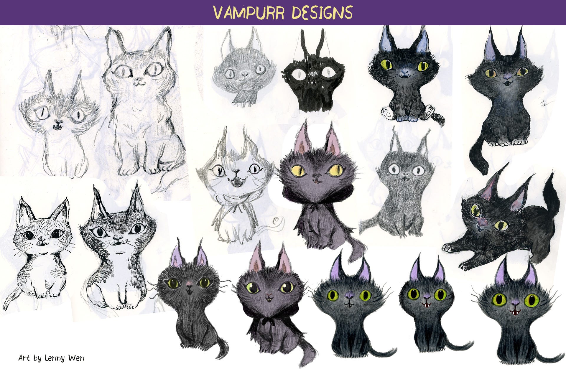
When creating the character, I needed to consider whether I could redraw it repeatedly without making my hand miserable. I considered graphite, pen, pastel, and acrylic itself.
Graphite: would be a pain in the wrist. Also, the silvery, reflecting quality would probably be awkward against acrylic, so nope.
Pen: same problem
Pastel: I tried Neocolor from Caran d'Ache; I love the buttery texture, but it’s hard to replicate. Also, the details of the fur could be muddy, so nope.
Acrylic: While it could create rich textures, I felt like I lost the softness and silkiness of Vampurr’s fur.
I’m not gonna lie, a lot of things were just something that mostly illustrators nitpick in their heads. Most people probably won’t even care or think about it. But I personally take a lot of pride in the process. The process is the most enjoyable part, which nobody could take away, especially a machine!
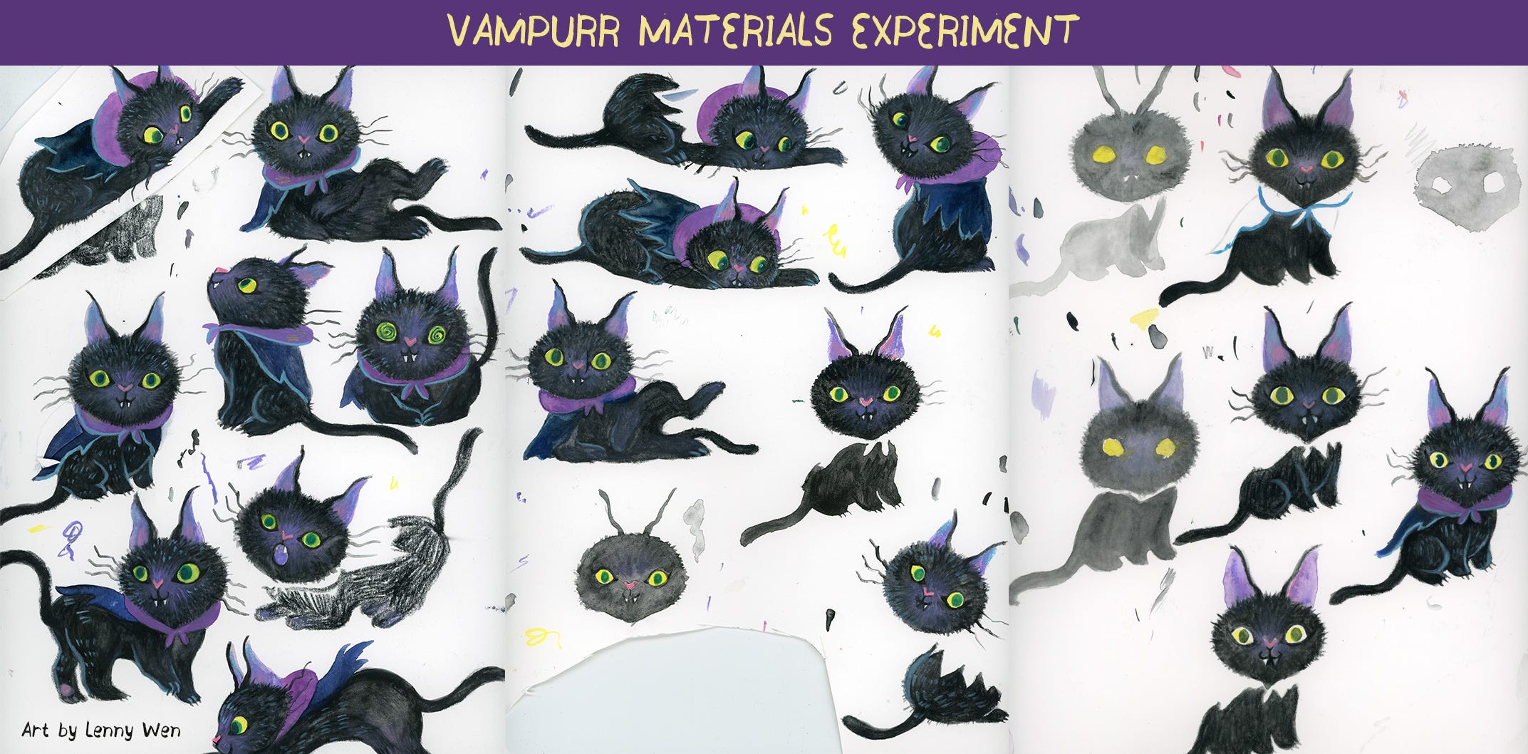
So after a bunch of experiments… «drumroll» I finally chose Ecoline liquid watercolor as Vampurr’s base paint.
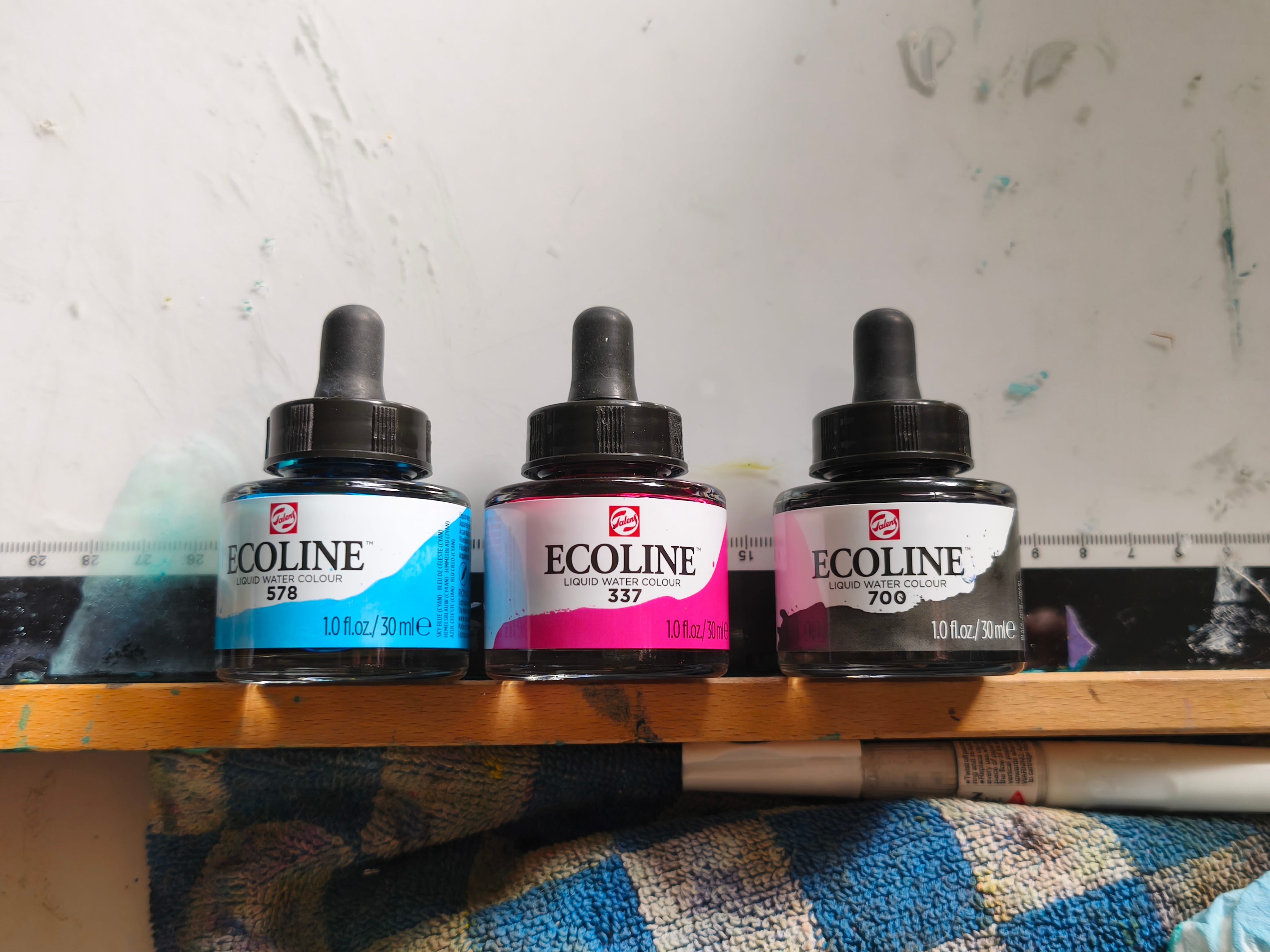
It created the soft, silky, shiny quality of Vampurr’s fur, and the effect was also easy to replicate. Vampurr’s design was also a back-and-forth between Mina Chung; the art director, and me. She emphasized how Vampurr should resemble a kitten and be more delicate. So voilà! Here is Vampurr's final form!
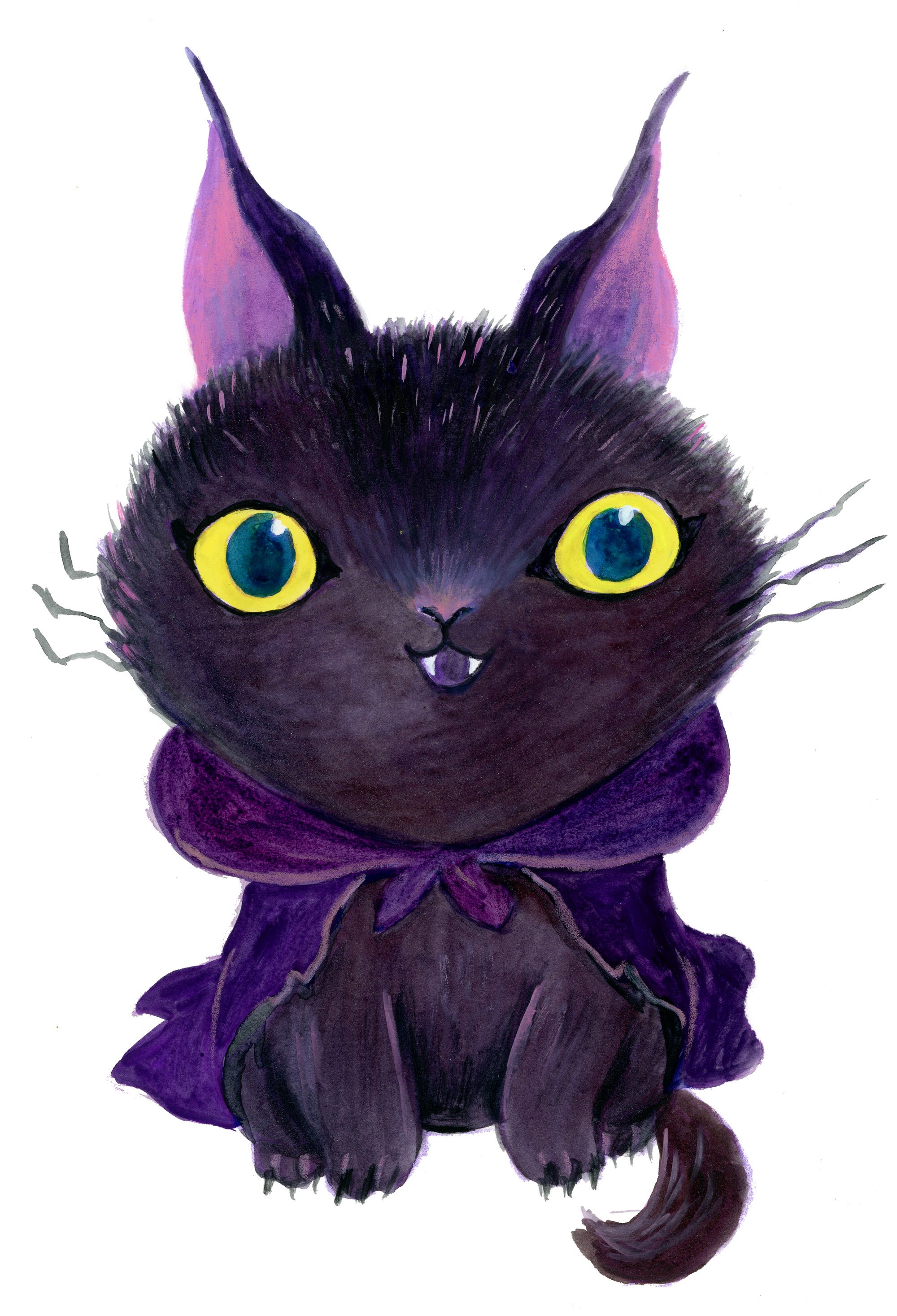
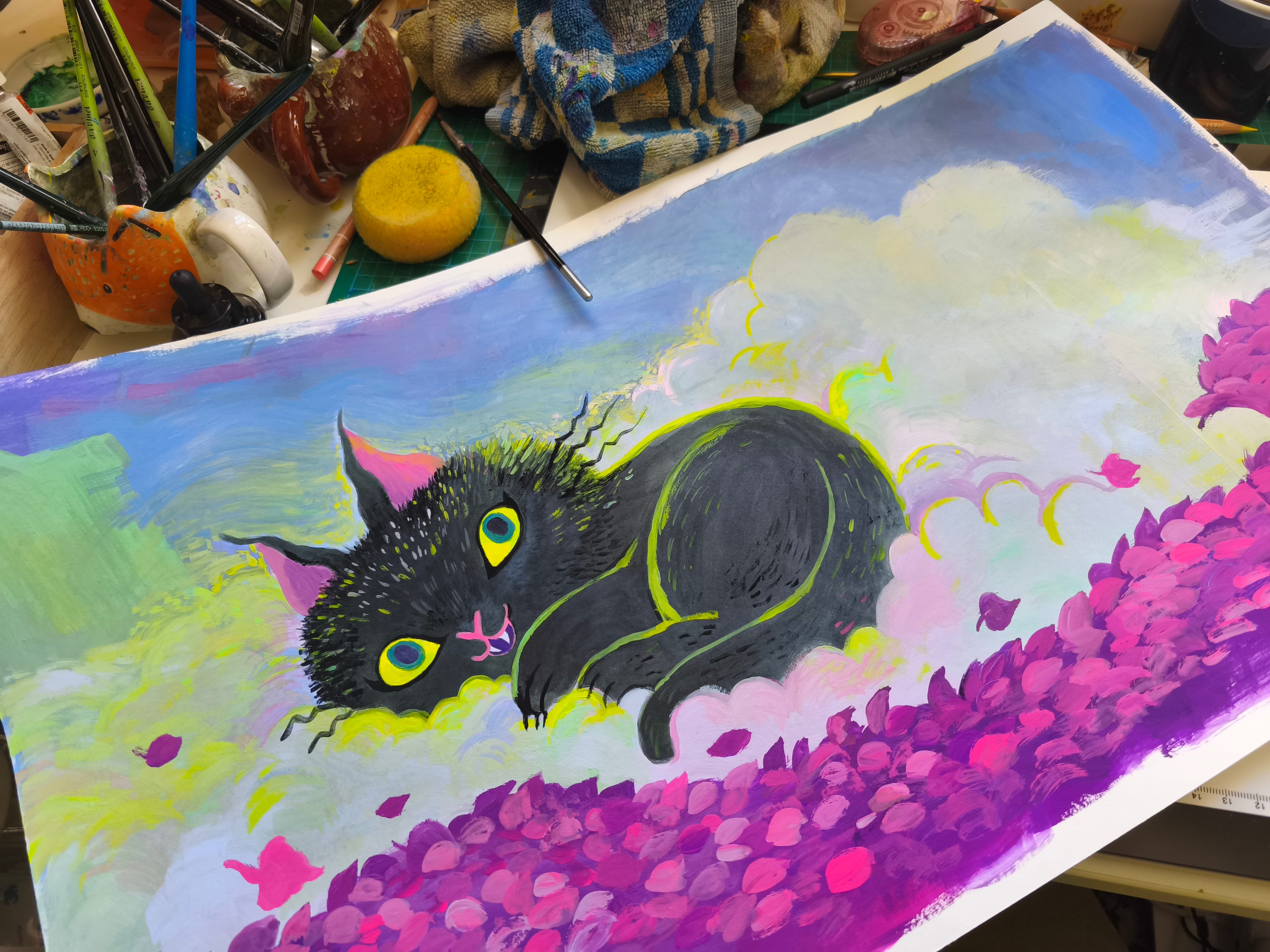
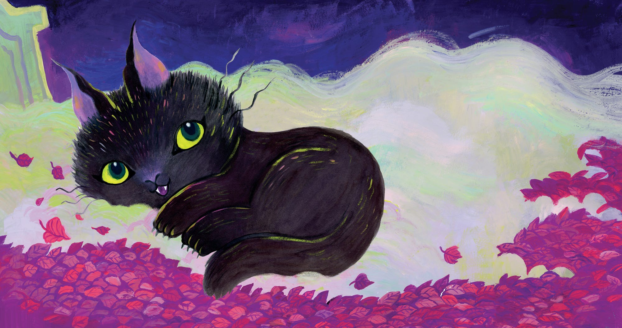
Then the other character was Victor; his design was pretty clear from the get-go.
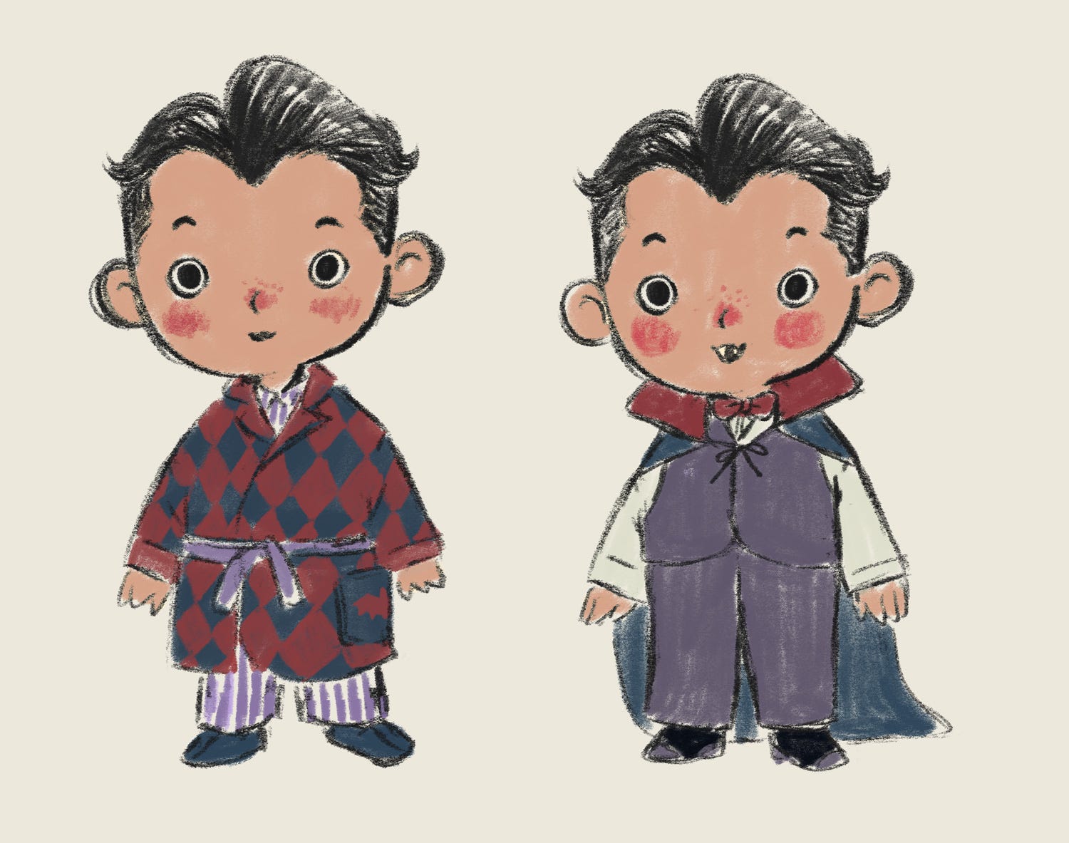


I traveled back to Indonesia while working on Vampurr, so I bought a wet palette with a lid. It worked pretty well!
Aside from Vampurr herself, another challenging part was finding the right color composition. It’s so out of my comfort zone, so it took me a while to combine colors, a lot of trial and error, and even to get used to it.
The last one was designing the hand lettering for the title. It was another favorite process of mine.
How It Turned Out…
It’s the first time I got like three papers to choose from during the proof. One of the best proof experiences I ever had!
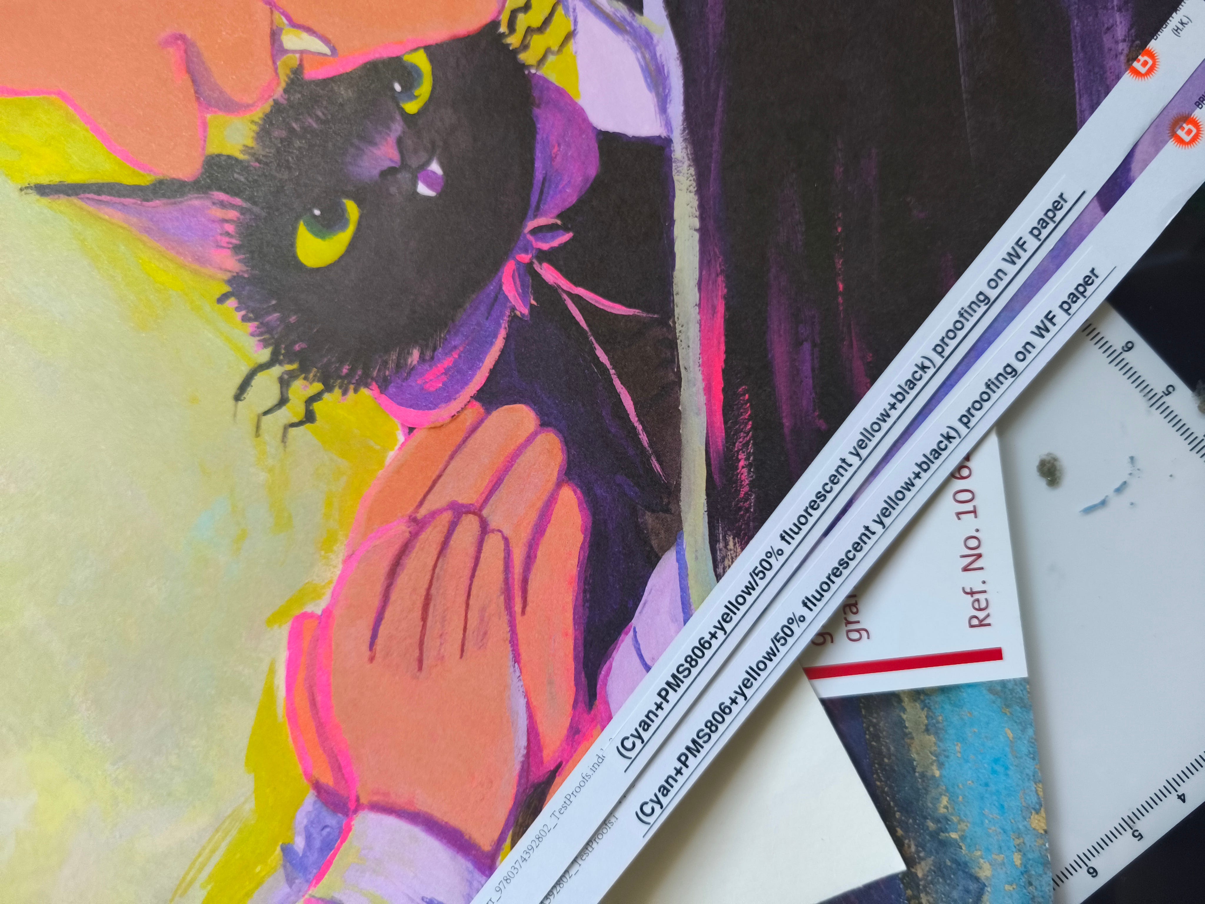
I was immediately blown away by how the colors turned out on this particular piece of paper. The texture felt so good on my hand, and the neon colors popped; what a dream! I knew it was a rare privilege to choose among different papers, so I truly appreciated it. I love every single detail in the final book. I can’t stop gushing over the UV spot, the matte laminating, and so on!
Final Notes…
I feel so lucky to be part of Vampurr. Massive thanks to Justin, Janine, Mina, Christy, and the whole team in FSG. Justin has been super kind and supportive from the beginning, a collaborator all illustrators wish for! (I honestly feel super lucky that all the authors I’ve worked with are super kind and cool people).
I’m super proud of this book. When I sent the final PDF to the team, I was so unsure. Would the entire team like it? Would the author like it? The colors were so experimental to me, and I put so much pressure on myself. So when the team came back to me and Justin personally emailed me about how much they loved it, I was over the moon. All the hard work paid off!
I hope you get a copy of Vampurr; no shame in buying it wherever you prefer (if you could get it from your local bookstores, that would be super cool, though!). Or borrow it from your library!
Thank you for reading!
You got to choose the paper?! The editors on this definitely understood illustrated children’s books!! I also loved hearing how the ink was how you solved the kitty’s fur “consistency.”
Congrats! The character design and color palette create the perfect atmosphere!